live - 60fps 1920 x 1080
<!DOCTYPE html>
<html>
<head>
<title>3D Perspective Data Tunnel</title>
<style>
    body, html {
        margin: 0;
        padding: 0;
        width: 100%;
        height: 100%;
        overflow: hidden;
        background: radial-gradient(ellipse at 50% 50%, #1a2c3a 0%, #0a0f14 100%);
    }
    .scene {
        position: relative;
        width: 100%;
        height: 100%;
        perspective: 200px; /* Key property for the 3D effect */
    }
    .packet {
        position: absolute;
        left: calc(var(--x) * 1%);
        top: calc(var(--y) * 1%);
        font-family: 'Roboto Mono', 'Courier New', monospace;
        font-size: 1.2rem;
        padding: 5px 20px;
        border-radius: 4px;
        background: linear-gradient(90deg, rgba(23, 107, 135, 0.2), rgba(23, 107, 135, 0.7));
        border: 1px solid #4391ab;
        color: #cde4eb;
        text-shadow: 0 0 5px #cde4eb;
        white-space: nowrap;
        animation: fly-through 10s linear infinite;
        animation-delay: calc(var(--d) * -1s);
    }
    @keyframes fly-through {
        0% {
            /* Start deep in the background, small and blurry */
            transform: translateZ(-500px) translateY(-50px) scale(0.2);
            opacity: 0;
            filter: blur(4px);
        }
        10% {
             opacity: 1; /* Fade in */
        }
        90% {
            opacity: 1;
        }
        100% {
            /* End up close to the screen, large and clear, then gone */
            transform: translateZ(200px) translateY(0px) scale(1.5);
            opacity: 0;
            filter: blur(0px);
        }
    }
    .up {
        color: #61e786;
    }
    .down {
        color: #fe5f55;
    }
</style>
</head>
<body>
<div class="scene" id="scene-container"></div>
<script>
    const container = document.getElementById('scene-container');
    const tickers = ['BTC/USD', 'ETH/USD', 'USD/CAD', 'MSFT', 'AMZN', 'EUR/GBP', 'SOL/USD', 'XRP/JPY'];
    const numPackets = 50;

    function generatePacketContent() {
        const ticker = tickers[Math.floor(Math.random() * tickers.length)];
        const isUp = Math.random() > 0.5;
        const value = (1 + Math.random() * 9999).toFixed(2);
        const change = (Math.random() * 3).toFixed(2);
        const symbol = isUp ? '▲' : '▼';
        const colorClass = isUp ? 'up' : 'down';

        return `${ticker} ${value} <span class="${colorClass}">${symbol}${change}%</span>`;
    }

    for (let i = 0; i < numPackets; i++) {
        const packet = document.createElement('div');
        packet.className = 'packet';
        packet.innerHTML = generatePacketContent();

        // Random starting positions across the screen
        packet.style.setProperty('--x', Math.random() * 80 + 10); // 10% to 90%
        packet.style.setProperty('--y', Math.random() * 80 + 10); // 10% to 90%

        // Random animation delay to stagger them
        packet.style.setProperty('--d', Math.random() * 10);

        container.appendChild(packet);
    }
</script>
</body>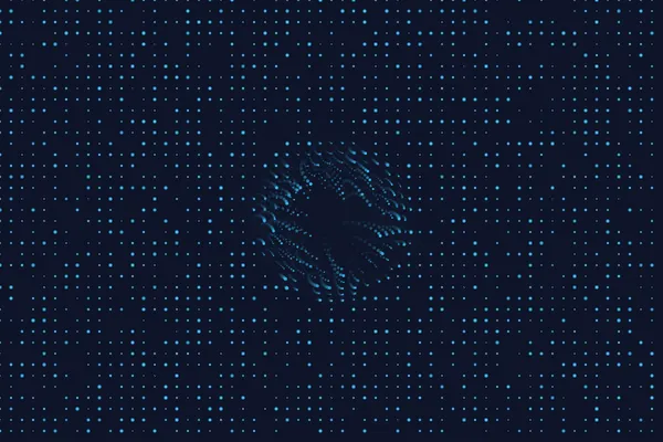
</html>About this animation
A perspective view traveling through a data tunnel.
Under the hood
WebGL Grid Transformation
This uses basic 3D perspective mapping. By adjusting CSS
perspective or deploying a lightweight Three.js camera, a flat 2D grid is warped to simulate infinite depth. The camera continually moves forward along the Z-axis while looping the grid to maintain the illusion of an endless tunnel. Related