live - 60fps 1920 x 1080
<!DOCTYPE html>
<html lang="en">
<head>
    <meta charset="UTF-8">
    <meta name="viewport" content="width=device-width, initial-scale=1.0">
    <title>Cosmic</title>
    <meta name="category" content="Space">
    <style>
        * {
            margin: 0;
            padding: 0;
            box-sizing: border-box;
        }
        body {
            overflow: hidden;
            background: radial-gradient(ellipse at bottom, #1b2735 0%, #090a0f 100%);
            height: 100vh;
            width: 100vw;
        }
        #canvas {
            position: absolute;
            top: 0;
            left: 0;
        }
        .star {
            position: absolute;
            background: white;
            border-radius: 50%;
            animation: twinkle var(--duration) ease-in-out infinite;
            animation-delay: var(--delay);
            box-shadow: 0 0 var(--glow) rgba(255, 255, 255, 0.9);
        }
        @keyframes twinkle {
            0%, 100% {
                opacity: 0.2;
                transform: scale(0.8);
            }
            50% {
                opacity: 1;
                transform: scale(1.3);
            }
        }
        .shooting-star {
            position: absolute;
            width: 2px;
            height: 2px;
            background: white;
            border-radius: 50%;
            box-shadow: 0 0 8px 2px rgba(255, 255, 255, 0.9);
        }
        .shooting-star::before {
            content: '';
            position: absolute;
            top: 0;
            right: 0;
            width: 80px;
            height: 1px;
            background: linear-gradient(90deg, rgba(255, 255, 255, 0) 0%, rgba(255, 255, 255, 0.8) 100%);
            transform: translateX(2px);
        }
        @keyframes shoot {
            0% {
                transform: translate(0, 0) rotate(-45deg);
                opacity: 1;
            }
            100% {
                transform: translate(-300px, 300px) rotate(-45deg);
                opacity: 0;
            }
        }
        .asteroid {
            position: absolute;
            border-radius: 50%;
            background: linear-gradient(135deg, #8b7355 0%, #5c4a3a 50%, #3d3227 100%);
            box-shadow:
                inset -5px -5px 10px rgba(0, 0, 0, 0.5),
                0 0 20px rgba(139, 115, 85, 0.3);
        }
        @keyframes asteroid-drift {
            0% {
                transform: translate(0, 0) rotate(0deg);
                opacity: 0;
            }
            5% {
                opacity: 1;
            }
            95% {
                opacity: 1;
            }
            100% {
                transform: translate(var(--drift-x), var(--drift-y)) rotate(360deg);
                opacity: 0;
            }
        }
    </style>
</head>
<body>
    <canvas id="canvas"></canvas>
    <script>
        const canvas = document.getElementById('canvas');
        const ctx = canvas.getContext('2d');

        canvas.width = window.innerWidth;
        canvas.height = window.innerHeight;

        // Create twinkling stars
        function createStars() {
            for (let i = 0; i < 200; i++) {
                const star = document.createElement('div');
                star.className = 'star';

                const size = Math.random() * 2.5 + 0.5;
                const x = Math.random() * 100;
                const y = Math.random() * 100;
                const duration = Math.random() * 4 + 2;
                const delay = Math.random() * 5;

                star.style.width = size + 'px';
                star.style.height = size + 'px';
                star.style.left = x + '%';
                star.style.top = y + '%';
                star.style.setProperty('--duration', duration + 's');
                star.style.setProperty('--delay', delay + 's');
                star.style.setProperty('--glow', (size * 3) + 'px');

                document.body.appendChild(star);
            }
        }

        // Create shooting stars
        function createShootingStar() {
            const star = document.createElement('div');
            star.className = 'shooting-star';

            const startX = Math.random() * window.innerWidth;
            const startY = Math.random() * (window.innerHeight * 0.6);
            const duration = Math.random() * 1 + 0.8;

            star.style.left = startX + 'px';
            star.style.top = startY + 'px';
            star.style.animation = `shoot ${duration}s linear`;

            document.body.appendChild(star);

            setTimeout(() => star.remove(), duration * 1000);
        }

        // Create asteroids
        function createAsteroid() {
            const asteroid = document.createElement('div');
            asteroid.className = 'asteroid';

            const size = Math.random() * 30 + 15;
            const startX = Math.random() * window.innerWidth;
            const startY = -50;
            const driftX = (Math.random() - 0.5) * 400;
            const driftY = window.innerHeight + 100;
            const duration = Math.random() * 15 + 10;

            asteroid.style.width = size + 'px';
            asteroid.style.height = size + 'px';
            asteroid.style.left = startX + 'px';
            asteroid.style.top = startY + 'px';
            asteroid.style.setProperty('--drift-x', driftX + 'px');
            asteroid.style.setProperty('--drift-y', driftY + 'px');
            asteroid.style.animation = `asteroid-drift ${duration}s linear`;

            // Add texture
            const texture = Math.floor(Math.random() * 3);
            if (texture === 0) {
                asteroid.style.background = 'linear-gradient(135deg, #6b5d52 0%, #4a3f36 50%, #2e2620 100%)';
            } else if (texture === 1) {
                asteroid.style.background = 'linear-gradient(135deg, #9b8370 0%, #6d5d4f 50%, #4a3d32 100%)';
            }

            document.body.appendChild(asteroid);

            setTimeout(() => asteroid.remove(), duration * 1000);
        }

        // Initialize
        createStars();

        // Continuous shooting stars
        setInterval(() => {
            if (Math.random() > 0.3) {
                createShootingStar();
            }
        }, 2000);

        // Occasional asteroids
        setInterval(() => {
            if (Math.random() > 0.6) {
                createAsteroid();
            }
        }, 4000);

        // Initial burst
        setTimeout(() => createShootingStar(), 500);
        setTimeout(() => createShootingStar(), 1200);
        setTimeout(() => createAsteroid(), 2000);

        // Resize handler
        window.addEventListener('resize', () => {
            canvas.width = window.innerWidth;
            canvas.height = window.innerHeight;
        });
    </script>
</body>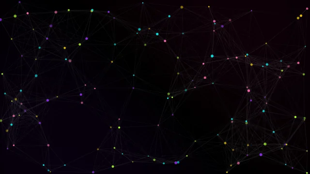
</html>About this animation
Deep space cosmic background effect.
Under the hood
Deep Space Parallax
Layered starfields moving at different speeds to create a parallax effect. Foreground stars are brighter and move faster than the dim, slow background stars, simulating a massive sense of scale.