live - 60fps 1920 x 1080
<!DOCTYPE html>
<html>
<head>
<title>3. Ascendant Light</title>
<style>
    body {
        margin: 0;
        height: 100vh;
        background-color: #1a1a2e;
        overflow: hidden;
        position: relative;
    }

    .light-source {
        position: absolute;
        top: -20%;
        left: 50%;
        width: 300%;
        height: 150%;
        transform: translateX(-50%);
        background: linear-gradient(
            45deg,
            rgba(255, 238, 204, 0) 40%,
            rgba(255, 238, 204, 0.25) 48%,
            rgba(255, 238, 204, 0.25) 52%,
            rgba(255, 238, 204, 0) 60%
        );
        animation: pan-light 10s infinite linear;
        /* To create a soft origin point for the rays */
        -webkit-mask-image: radial-gradient(ellipse at 50% -20%, black 20%, transparent 70%);
        mask-image: radial-gradient(ellipse at 50% -20%, black 20%, transparent 70%);
    }

    .light-source.two {
        transform: translateX(-50%) rotate(-20deg);
        animation-duration: 8s; /* Vary speed for realism */
    }

    @keyframes pan-light {
        from { transform: translateX(-50%) rotate(-40deg); }
        to { transform: translateX(-50%) rotate(40deg); }
    }

    .mote-container {
        position: absolute;
        top: 0; left: 0;
        width: 100%;
        height: 100%;
    }

    .mote {
        position: absolute;
        width: 4px;
        height: 4px;
        background: #fff;
        border-radius: 50%;
        opacity: 0.5;
        box-shadow: 0 0 10px #ffeecc;
        animation: float 10s infinite linear;
    }

    @keyframes float {
        0% {
            transform: translateY(110vh) translateX(0) rotate(0deg);
            opacity: 0;
        }
        10% { opacity: 0.7; }
        90% { opacity: 0.7; }
        100% {
            transform: translateY(-10vh) translateX(100px) rotate(360deg);
            opacity: 0;
        }
    }
</style>
</head>
<body>

<div class="light-source"></div>
<div class="light-source two"></div>

<div class="mote-container" id="moteContainer"></div>

<script>
    const container = document.getElementById('moteContainer');
    const numMotes = 50;

    for (let i = 0; i < numMotes; i++) {
        const mote = document.createElement('div');
        mote.className = 'mote';

        const size = Math.random() * 3 + 1;
        mote.style.width = `${size}px`;
        mote.style.height = `${size}px`;

        mote.style.left = `${Math.random() * 100}vw`;
        mote.style.animationDelay = `${Math.random() * -10}s`;
        mote.style.animationDuration = `${Math.random() * 5 + 8}s`;

        container.appendChild(mote);
    }
</script>


<script>
  /**
   * Animation control function, called on every frame.
   * @param {object} frame - The animation frame object (contains time, progress, etc.).
   */
  window.nextFrame = function(frame) {
    // AI-suggested functions to consider for this animation:
    // - document.querySelectorAll\n    // - element.style.transform\n    // - element.style.opacity\n    // - Math.sin\n    // - Math.cos\n    // - performance.now\n    // - Math.random\n    // - element.style.animationDuration\n    // - element.style.animationPlayState\n    // - element.animate\n    // - container.appendChild\n    // - element.remove

    // Add your animation logic here.
    // console.log('Current frame progress:', frame.progress);

    // Bridge to existing animation if any.
    if (typeof animate === 'function') {
      animate(frame.time);
    }
  }

  // If there's an existing animation loop, we can modify it to be controlled by nextFrame.
  // This is a placeholder for how you might adapt your code.
  if (typeof requestAnimationFrame === 'function' && !window.__HTV__?.exporting) {
    let tick = 0;
    function animate(time) {
      // Your animation logic driven by RAF.
      tick++;
      // draw(tick);
      requestAnimationFrame(animate);
    }
    // requestAnimationFrame(animate);
  }
</script>
</body>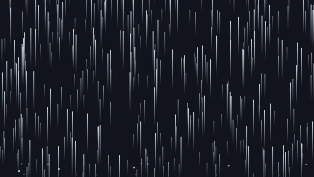
</html>About this animation
Rising beams of ethereal light.
Under the hood
SVG Gradient Flow
Built on optimized SVG markup, this animation transitions between multiple linear and radial gradients. SVG properties are extremely scalable, ensuring the light blooms remain perfectly crisp on high-DPI retina displays without inflating file sizes.
Related