live - 60fps 1920 x 1080
<!DOCTYPE html>
<html lang="en">
<head>
<meta charset="UTF-8">
<meta name="viewport" content="width=device-width, initial-scale=1.0">
<title>Background 3: Star Genesis</title>
<style>
    body {
        margin: 0;
        height: 100vh;
        background-color: #000;
        overflow: hidden;
    }
    .background, .foreground {
        position: fixed;
        top: 0; left: 0;
        width: 100%; height: 100%;
    }

    /* Soft, distant twinkle */
    .static-star {
        position: absolute;
        background-color: white;
        border-radius: 50%;
        animation: twinkle 10s infinite;
    }

    @keyframes twinkle {
        0%, 100% { opacity: 0.3; }
        50% { opacity: 0.8; }
    }

    /* The large gas cloud */
    .nebula-cloud {
        position: absolute;
        width: 100%; height: 100%;
        background: radial-gradient(ellipse at 50% 50%, rgba(127, 0, 255, 0.15) 0%, transparent 60%),
                    radial-gradient(ellipse at 20% 80%, rgba(0, 255, 221, 0.1) 0%, transparent 50%),
                    radial-gradient(ellipse at 80% 20%, rgba(255, 0, 149, 0.1) 0%, transparent 50%);
        animation: breathe 20s ease-in-out infinite alternate;
        filter: blur(40px);
    }

    @keyframes breathe {
        from { transform: scale(1) rotate(0deg); opacity: 0.7; }
        to { transform: scale(1.1) rotate(20deg); opacity: 1; }
    }

    /* Star birth effect */
    .forming-star {
        position: absolute;
        width: 3px; height: 3px;
        border-radius: 50%;
        background-color: #fff;
        animation: star-birth 10s ease-out infinite;
        opacity: 0;
    }

    @keyframes star-birth {
        0%, 40%, 100% {
            transform: scale(0.1);
            opacity: 0;
            box-shadow: none;
        }
        50% {
            transform: scale(2);
            opacity: 1;
            box-shadow: 0 0 15px 3px #fff, 0 0 30px 8px #00eaff;
        }
        60% {
            transform: scale(0.8);
            opacity: 0.5;
            box-shadow: 0 0 10px 2px #fff, 0 0 20px 5px #00eaff;
        }
    }
</style>
</head>
<body>

<div class="background" id="static-stars"></div>
<div class="nebula-cloud"></div>
<div class="foreground" id="forming-stars"></div>

<script>
    const staticContainer = document.getElementById('static-stars');
    const formingContainer = document.getElementById('forming-stars');
    const numStaticStars = 200;
    const numFormingStars = 50;

    // Create background twinklers
    for (let i = 0; i < numStaticStars; i++) {
        const star = document.createElement('div');
        star.className = 'static-star';
        const size = Math.random() * 1.5;
        star.style.width = `${size}px`;
        star.style.height = `${size}px`;
        star.style.top = `${Math.random() * 100}%`;
        star.style.left = `${Math.random() * 100}%`;
        star.style.animationDelay = `${Math.random() * -10}s`;
        staticContainer.appendChild(star);
    }

    // Create bright, flaring stars
    for (let i = 0; i < numFormingStars; i++) {
        const star = document.createElement('div');
        star.className = 'forming-star';
        star.style.top = `${Math.random() * 100}%`;
        star.style.left = `${Math.random() * 100}%`;
        // Distribute the flares evenly across the 10s loop duration
        star.style.animationDelay = `${Math.random() * -10}s`;
        formingContainer.appendChild(star);
    }
</script>

</body>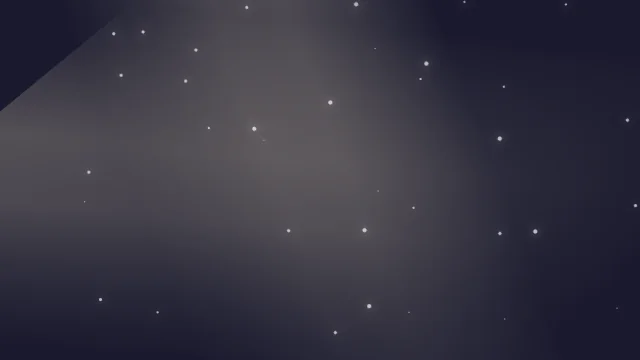
</html>About this animation
Formation of stars in a nebula.
Under the hood
Canvas Radial Gradients
This background dynamically generates
createRadialGradient objects on an HTML5 canvas to simulate glowing distant stars and nebulas. It's a high-performance alternative to using heavy, static background images. Related