live - 60fps 1920 x 1080
<!DOCTYPE html>
<html>
<head>
<title>Meteor Shower</title>
<meta name="category" content="Space">
<style>
  body {
    margin: 0;
    background: #000;
    overflow: hidden;
  }
  .stars-bg {
    position: absolute;
    width: 2px;
    height: 2px;
    background: transparent;
    box-shadow:
      /* A lot of stars using box-shadow for performance */
      52vw 83vh #FFF, 1vw 23vh #FFF, 8vw 9vh #FFF, 91vw 12vh #FFF, 65vw 4vh #FFF,
      33vw 33vh #FFF, 58vw 68vh #FFF, 9vw 53vh #FFF, 81vw 82vh #FFF, 67vw 21vh #FFF,
      23vw 45vh #FFF, 76vw 34vh #FFF, 14vw 89vh #FFF, 48vw 15vh #FFF, 98vw 55vh #FFF,
      5vw 61vh #FFF, 88vw 78vh #FFF, 29vw 19vh #FFF, 71vw 49vh #FFF, 43vw 93vh #FFF;
    animation: twinkle-stars 5s linear infinite;
  }
  @keyframes twinkle-stars {
    0% { opacity: 0.8; }
    50% { opacity: 1; }
    100% { opacity: 0.8; }
  }

  .meteor {
    position: absolute;
    width: 300px;
    height: 1px;
    transform: rotate(-45deg);
    background-image: linear-gradient(to left, #fff, rgba(255,255,255,0));
    animation: fall linear infinite;
  }
  .meteor::before {
    content: '';
    position: absolute;
    width: 2px;
    height: 2px;
    border-radius: 50%;
    background: #fff;
    right: -1px;
    top: -0.5px;
    box-shadow: 0 0 5px #fff, 0 0 10px #fff;
  }

  @keyframes fall {
    0% {
      transform: translateX(-500px) rotate(-45deg);
      opacity: 1;
    }
    100% {
      transform: translateX(calc(100vw + 500px)) rotate(-45deg);
      opacity: 0;
    }
  }
</style>
</head>
<body>
<div class="stars-bg"></div>
<div id="meteor-container"></div>

<script>
  const container = document.getElementById('meteor-container');
  const numMeteors = 5;

  for (let i = 0; i < numMeteors; i++) {
    const meteor = document.createElement('div');
    meteor.className = 'meteor';

    meteor.style.top = Math.random() * 100 + 'vh';
    meteor.style.left = '-300px'; // Start off-screen

    // Randomize duration and delay for a natural look
    const duration = Math.random() * 2 + 1; // 1 to 3 seconds
    const delay = Math.random() * 5; // 0 to 5 seconds

    meteor.style.animationDuration = duration + 's';
    meteor.style.animationDelay = delay + 's';

    container.appendChild(meteor);
  }
</script>
</body>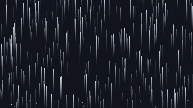
</html>About this animation
Falling meteors across a dark sky.
Under the hood
High-Velocity Linear Tracing
Meteor paths are drawn rapidly across a canvas utilizing
createLinearGradient to give the tail a fading, trailing glow. The coordinate logic spawns them off-screen with a sharp diagonal angle to ensure they cross the viewport realistically. Related